Plots
When a viewer is opened, the
right pane shows an envelope plot of the dependent variable for the full time range
of the project data. For
the Time Series Viewer, the range is the historical data only. For the
Forecast Viewer, the range is the historical data plus the forecasts.
Click  to select or deselect which envelope plots to display. This can be helpful when
working with plots for individually selected time seriesan aggregation of transactional data into specified time intervals and sorted according
to unique combinations of the default attributes (BY variables).
to select or deselect which envelope plots to display. This can be helpful when
working with plots for individually selected time seriesan aggregation of transactional data into specified time intervals and sorted according
to unique combinations of the default attributes (BY variables).
By default, the plot reflects the aggregate data from all of the time series in the project. The plot changes to reflect any filtersa set of specified criteria that are applied to data in order to identify the subset of data for a subsequent operation, such as continued processing. that you select from the Filters pane or time series that you select from the Series pane.
Working with Plots
Follow these steps to explore the plots that are available in the Time Series Viewer and Forecast Viewer. For the Forecast Viewer, additional actions are described in Working with Plots in the Forecast Viewer.
- Click
 in the upper right corner of the plot.
The overview axis is displayed below the plot.
- Use the sliders at each end of the plot to zoom the plot to any range within the time series.
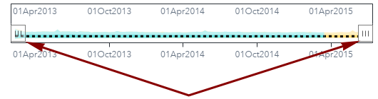
- When you are finished
using the overview axis, you can remove it by clicking again. The plot returns to show the full length of all of the time series.
- Examine the legend below the plot. The legend describes how the mean, first and second standard deviation, and the upper and lower boundaries (Range) are depicted in the plot.
- Hold your pointer over the mean line in the plot. The plot displays the date, mean, standard deviations, and range for that data point.
- Select one of the time series from the Series pane. A time plot of the selected time series is added to the
envelope plot.
You can select up to 16 time series from the Series pane by using the Ctrl or Shift keys. The time plot for each time series that you select is added to the envelope plot. See Time Series Selector for more information about selecting individual time series.
- Click
 to download the plot data and choose either raw data or data formatted for
your specific locale.
to download the plot data and choose either raw data or data formatted for
your specific locale.
The data is downloaded to your hard drive in CSV format. The downloaded data includes the following information for each time series.
- Minimum and maximum values by date
- Two standard deviation range by date
- One standard deviation range by date
- Mean by date
- To view the plot in
a larger frame, click
 . Click
  or use the Esc key to return to the pane view.
 - Take time to explore these features with different filters selected from the Filters pane. When you are finished, click Close to return to the pipeline.
Working with Plots in the Forecast Viewer
Overview
The Forecast Viewer enables you to customize the time plots for individual series that are selected from the Series. If envelope plots are displayed, the plots for each selected time series are superimposed over them. The following image shows the Forecast Viewer with two time series selected and the envelope plots removed.
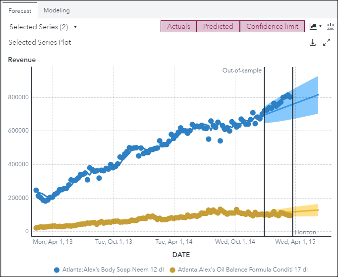
The Actuals, Predicted, and Confidence limit buttons over the plot are used to customize the display of any time series that you select from the Series pane. By default, the plot shows the actual values from the time series, the time plot of the predicted values from the model, and the range of the confidence limit in the forecasta numerical prediction of a future value for a specified time period for each unique combination of BY variable values horizonthe number of intervals into the future, beyond a base date, for which analyses and predictions are made.. Using these buttons, you can select or deselect which of these measures to display.
The plot for the Forecast Viewer includes a vertical line on the right side to delimit the start of the horizon. If an out-of-sample range is specified, another vertical line is provided to show the out-of-sample regionthe number of time periods before the end of the data that are removed when fitting models. After model selection, forecasts are generated in the out-of-sample region and then compared to the actual data to determine accuracy..
See Also
Modeling Tab for Forecast Viewer
The Forecast Viewer for the following modeling nodes includes a Modeling tab.
- Auto-forecasting
- Hierarchical Forecasting
- Hierarchical Forecasting (Pluggable)
The Modeling tab lists all of the candidate models for a single, selected time series. It shows the statistic of fita statistical value that is used to evaluate how well a forecasting model fits the historical series by comparing the actual data to the predicted values. generated based on the model selection criterionthe statistic of fit that is used for forecast model selection. that is chosen for the modeling node. If a holdout samplethe number of periods of the most recent data that should be excluded from the parameter estimation. The holdout sample can be used to evaluate the forecasting performance of a candidate model. is specified for the modeling node, the statistics are based on the holdout region. Otherwise, the statistics are calculated on the in-sample region.
For hierarchical forecasting, the statistics of fit value shown here differs from the measure that is shown when you right-click the time series in the Series pane and select Statistics of Fit. The measure in the Modeling tab is the value before reconciliation from the OUTSELECT table. The measure shown in the Series pane is the reconciled value from the OUTSTAT table .
In some circumstances, the candidate models listed on the Modeling tab can be out of date. This occurs after running a hierarchical modeling node using the Fit, Forecast, or Update task. The candidate models are not chosen when running these tasks, but the models selected from the previous run (using the Diagnose or Select task) remain on this tab. You should run the hierarchical modeling node again using the Diagnose or Select task to make sure you have the latest statistics and model selections.
In some cases, duplicate models are shown in the table on the Modeling tab. This occurs when Include combined models is selected in the right pane for a hierarchical node. This creates two model specifications in the OUTSELECT table, which is what is shown in the Modeling tab.
The selected champion
model is marked with the  indicator.
See Also
-
Generating Output from SAS Model Studio in SAS Visual Forecasting: Overview